Paste papers, Kleisterpapiere in German, are one of the oldest forms of decorated papers. They were "developed" in German-speaking areas during the late 16th century, and used to cover books and as endsheets. Among the most famous are the Herrenhuter papers made by members of the
Moravian Church, most often by women in "Single Sister" houses. When this group emigrated from Moravia to North America they settled largely in Pennsylvania during the 1740s,where they were active in printing, binding, and making these papers. Their
archives in the United States are in Bethlehem, PA.
Even in Germany they fell out of favor, were considered old-fashioned by the time the 19th century ended. However, with austerity measures during the First World War, paper bindings and the papers that decorated them came back, with many innovations in manufacture and aesthetics. Among them were paste papers. This was something Ernst Collin viewed as one of the few benefits of austerity and touched on in some of his articles.
Paste papers are made by mixing pigments (dry, tempera, acrylic, ...) into a paste made from flour, starches of other kinds, or more modern materials such as methylcellulose. Patterns can be made by brush strokes, pulling, stamps, rollers, any combination of these, and more. They have become very popular and there are numerous tutorials online. I have gathered many of these at the
Book Arts Web.
More recently, they were "reintroduced" by German immigrant binders who passed the skills and love of the papers to their apprentices, most actively in New England where Arno Werner taught and mentored many. Below from his obituary in the
New York Times dated 8/5/1995.
Arno Werner was born in Mylau, Saxony, one of 10
children of a weaver. He was apprenticed to a bookbinder at 13 and did
the customary stint as a journeyman moving around Europe. He came to New York in 1925 with $25 and his tools in a cigar box.
For years he shuttled between jobs in this country
and in Germany until he was persuaded to train with the famous master
binder Ignatz Wiemeler in Leipzig, a center of publishing and
antiquarian book dealers. He returned to the United States when war
broke out in 1939 and set up his own bindery in Pittsfield, Mass., in
1942. He maintained it until 1977, when he moved the workshop to
Hadlyme.
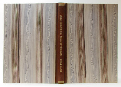 |
| Fritz Wiese's Sonderarbeiten des Buchbinders (1948) bound by Arno Werner |
From David Bourbeau's introductory essay in Katran Press'
Pastepapers of the Pioneer Valley,
Also in the latter half of the century, Arno Werner, a German-born and -trained master bookbinder, bound books for some the major antiquarian dealers, collectors, libraries, and printing masters of the day including the Cummington Press in the 1950s and Gehenna Press in the 1960s and 1970s. Arno had started making decorative papers in Pittsfield during the Second World War when European Products were difficult to come by... ... These he produced in the style of the Bauhaus movement that influenced most of his work. A Leonard Baskin and his Gehenna Press attracted and inspired a new generation of designer-printers, Arno Werner trained a new generation of studio bookbinders, Many of his students in turn have taught the art to others.
As mentioned by Bourbeau, these papers were made by and for private press books giving them a distinctive elegance, and their manufacture and use have spread across the United States. With this, some makers and presses have also issued elegant sample books of their papers, most with recipes and other tips. All-in-all, real treats for lovers of these decorated papers. A small selection of samples from this books in my collection can be found below:
Morris, Henry.
Roller-Printed Paste Papers for Bookbinding. North Hills, PA: Bird &
Bull Press, 1975
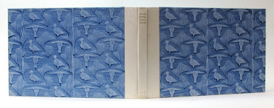 |
| Overall view of Roller-Printed Paste Papers with bird and bull pattern |
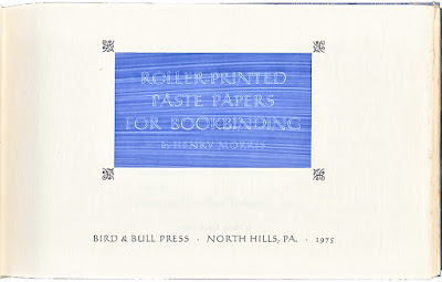 |
| Title Page |
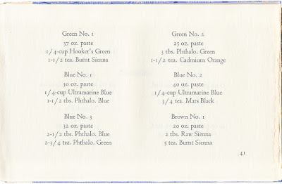 |
| Recipes |
 |
| Samples |
 |
| Samples. The one at left is the Bird & Bull "trademark." |
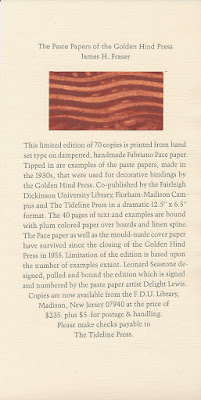
Fraser, James H.
The Paste Papers of the Golden Hind Press. Fairleigh Dickinson University Library and Tideline Press, 1983. Edition of 70. This book has been partially digitized
here. From the introduction:
Historical changes in the European process of spattering, combing, impressing or otherwise distributing colored paste on paper have been variations niore of design and color preference than of mechanics. To belabor the history or the technique, which is little more than a function of in1agination and deft fingers, would be redundant considering the writings of Albert Haemmerle or Rosamund Loring. [Loring's "notebook" is online]
The number of paste paper artisans since the close of the nineteenth century, where these two accounts leave us, has likely been greater than in all the previous centuries. Quite possibly there is quantitatively more paste paper being produced at the beginning of the 1980s than at any other time in history in the scores of countries in which, like the United States, a revival in the book arts is being experienced. Yet with this productivity there is perhaps little to be added to our understanding of this simplest of paper decorating procedures except to document and exhibit so1nething of their variety.
 |
| Title page |
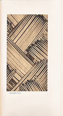 |
| Example Four |
 |
| Examples Nine and Ten |
 |
| Prospectus |
Bolton, Claire.
Maziarczyk Paste Papers. Oxford: The Alembic Press, 1991. Edition of 175. 8vo. quarter cloth, paste paper over boards. 53 pages. Contains nineteen samples of
Claire Maziarczyk's paste papers, and also describes how they are made.
The text includes a history of paste papers and notes on the range of
patterns used. quarter cloth, paste paper over boards.
In the introduction, Bolton gives an overview of the historical use of paste papers, also mentioning an article by Paul Adam, "
Die Kleistermamorpapiere" in
Archiv für Buchbinderei, v7, nr 12 1907-1908 (176-182).
In the section on "markets," Bolton notes that "Maziarczyk papers today sell to two main groups, bookbinders and interior designers, and the colours and the patterns are chosen with these two groups very much in mind... Apart from book covers and endpapers Maziarczyk papers are regularly used by designers as backdrops for photographers."
Before retiring from making paste papers, Claire Maziarczyk
presented widely in the United States and Canada often including tips for ergonomics to reduce repetitive stress injuries. Her website is
here.
 |
| Title page |
 |
| Sample from text describing process |
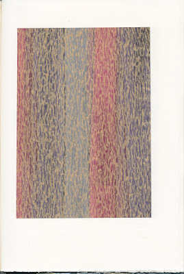 |
| Sample - Maziarczyk's papers often have an iridescent shine. |
 |
| Sample - Maziarczyk's papers often have an iridescent shine. |
 |
| Sample |
 |
| Sample |
Bookbinder Elissa Campbell wrote about a visit to Claire Maziarczyk in her
blog, sharing many images of the Studio.
One of my absolutely favorite people in the book arts is
Warwick Press' Carol Blinn whose work ranges from her whimsical
Once Upon a Time books to the serious. Throughout, Carol makes use of paste papers, a technique she learned from Arno Werner and taught frequently. You can see some
images from workshops on her website. On the subject of paste papers, wrote two small chapbooks,
Decorative Paste Papers at Warwick Press (1991) and
On Making Decorative Paste Papers (2005) in which she shared tips and tricks.
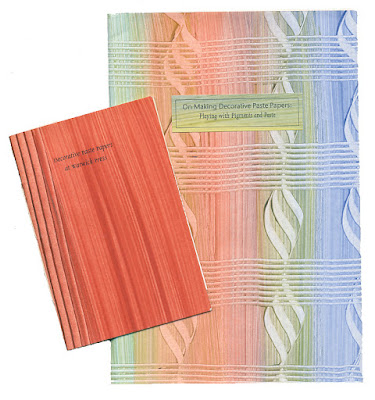 |
| Blinn's chapbooks |
Her magnum opus on the topic, however, is
Serious Play: Decorated Paste Papers, as much a tribute to her path and experiences learning from and working with Arno Werner, as it is a sampler.
Blinn, Carol J.
Serious Play: Decorated Paste Papers. Easthampton, MA: Warwick Press, 2006. Edition of 35.
From the prospectus:
This book is the most ambitious to date issued from
Warwick Press. The text describes my introduction to paste papers and
explores my friend-ship with bookbinder Arno Werner. My affection for
Arno shines through the description of his showing me how to decorate
with paste. Early photographs of Arno as well as reproductions of some
of my papers used on Warwick Press projects are included. For many years
I have wanted to document my papers. This book is the result of endless
prodding to
get the edition done before I become too feeble to life a
paint brush. Serious Play is a unique gathering together of my
writing and paste papers and it gives me great joy to present it to
discerning collectors. I fell in love with the making of this book &
I hope you will too.
35 copies; 64 pages; 7 by 9 ½ inches high;
designed, typeset in Dante, and letterpress printed by Carol on Zerkall
Book; 22 paste paper samples, with descriptions of how to make each
one; stenciled title page; a calligraphed title by Sarah Roberts; 12
digitally reproduced illustrations; hand bound by Carol with
paste-paper-over-board covers glued onto signatures bound using a
four-needle Coptic sewing stitch, the spine of the book being exposed;
wrapped in an orange paper wrapper with colored label; signed.

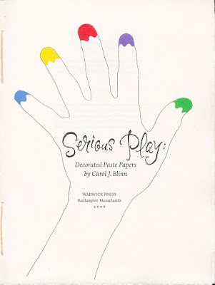 |
| Title page |
 |
| Sample with description below |
 |
| Sample with description below |
 |
| Sample with description below |
 |
| Sample with description below |
Another Easthampton binder with the same lineage back to Arno Werner, a neighbor of Carol Blinn's at One Cottage Street, is
Sarah Creighton. A selection of her beautiful papers can be found on her website, papers she often used in her edition bindings and other creations. There are numerous others, too.
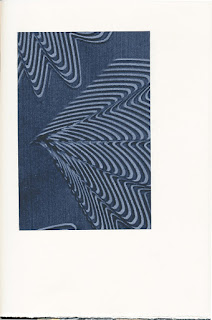
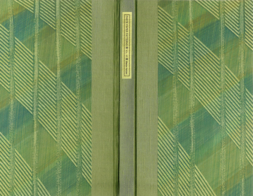
On the West Coast we find Marie Kelzer who produced a series of seven
Paste Paper Pattern Books between 2002 – 2012. All of these contain recipes and tips and tricks regarding the techniques used to make the papers, this along with an average of 50 tipped in samples. Kelzer was introduced to the technique by Eleanor Ramsey, a binder in San Francisco, and also learned from Claire Maziarczyk.
 |
| Paste Paper Pattern Book, Volume VI |
 |
| Sample with description below |
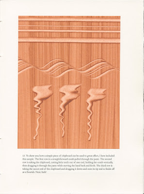
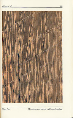 |
| Sample with description below. Note use of toy cars. |
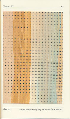 |
| Sample with description below. Note use of pastry rollers. |
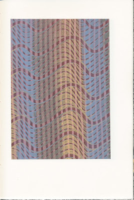
Not from a sample book, here two papers by Don Rash Fine Bookbinder on books from his Boss Dog Press.
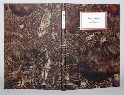 |
Fritz Eberhard's Three Lectures covered in original pastepaper
Click here to see how the pastepaper was made on the Boss Dog Press blog |
Below some links to pages in English and German about (historical) paste papers, all with lots of images:
So, head to your benches and make paste papers keeping in mind Henry Morris' "parting words."
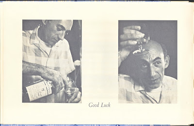 |
| Good Luck |
Some more paste paper covered books from my collection at the link above, one by a "professional," the others by apprentices.


