Tuesday, December 21, 2021

Pressbengel Deluxe Edition

Sometime late this summer while googling around aimlessly, I found a link to what was described as the deluxe edition of Ernst Collin's Pressbengel bound in full parchment. This was on my bucket list and given that it was limited to 30 copies bound in either full leather or parchment, the time it was published in, and the history of that time, including WW II, I felt it was nothing but a dream. The Heftlade the journal of the Jakob-Krause-Bundes published by Ernst Collin had an advertisement for the Pressbengel. A copy of the deluxe in leather is depicted in the Max Hettler collection collection in Stuttgart, the binding for both variants bound for the Euphorion Verlag by Hübel & Denck in Leipzig. 

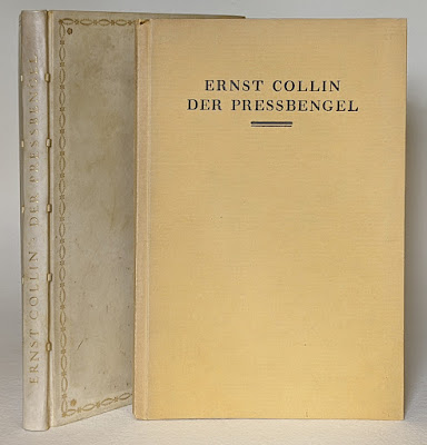
Regular with spine of deluxe bound in parchment at left.
The title stamping is identical between the leather and
parchment variants of the deluxe edition.

Der Pressbengel, 1000 copies bound in paper,
30 copies on handmade Zanders rag paper, bound 
in full leather or parchment.

Below the pricing for the Pressbengel, leather or parchment for 85 Marks, paper for 4.50 Marks. This was during the period of hyper-inflation that started the end of 1922 and extended through 1923, so I will need to do some real math as hyperinflation currency was printed at ever greater denominations. A website that converts historical currency values calculated that 85 Mark (1922) has a value of $3931.93 current dollars, and 4.50 Mark (1922) $208.16 current dollars. Can that be right? More on hyper-inflation in my annual post from 2020.

85 [Gold] Marks for the deluxe, 4.50 for the paper binding

Anyhow, back to the listing I found googling... I had not given myself a top-end budget for the deluxe, so ordered on the spot and had it arrive ca. 3 weeks later. Below pictures with some detail views that also raised questions...

Spine and front of deluxe. The book was
sewn on 5 parchment slips.

Colophon indicating this copy number 7.

Top edge gilt with hand-sewn endband. All leaves are perfectly
flush and gilt.

An Euphorion [Verlag] binding.
Note the sloppy trimming with the blue (fill?) underneath.

Bound at Hübel & Denck in Leipzig.

Cloth guard around made endpaper signature.
Paper on verso of 1st and 2nd flyleaves identical to text.
The cloth was common on full vellum bindings. and would have
extended across the full width of the doublure. This is also how
I learned it during my apprenticeship in Germany.

The 5 vellum slips as seen through the doublure.
Note the staining on the flyleaf, also visible in the back.
Was the staining and abrasion/tearing in the joint the result of
a repair, or do we blame an apprentice?

Handmade rag paper for the text block measures 10 thousandths
of an inch or .25 mm. Rather thick and stiff...

Ernst Collin wrote an article about the publisher's bindings created for the Euphorion Verlag at Hübel & Denck in the Archiv für Buchgewerbe und Graphik, vol 58, 1921 (pp. 270-271). Pictures accompanying the article can be viewed here.

In the article, Collin wrote "that the bindings he viewed for the article were less than beautiful (wenig schön) but serviceable exemplars of what we would consider fine bindings... The bindings are stamped with Euphorion Verlag and Hübel & Denck Leipzig." Keeping in mind the exponential increase in luxury editions, Collin wrote that the owner of such an edition is [still] entitled to work that  represents the best in terms of craft and aesthetics, balanced against the cost pressures exerted on the publisher, and always bound by hand. Production of these bindings was managed by Heinrich Bahle who was a member of the Jakob-Krause-Bundes (precursor to the Meister der Einbandkunst). Collin notes that by indicating the relationship between publisher and binder that it was a joint effort. This also includes the effort that went into the work of the publisher, such as negotiating with the printer about type face and typography, something that is not always as perfect as it should be at the beginning of a relationship. Continuing, Collin notes that these bindings are created using classical tooling patterns and that the judgement of the expert bookbinder is critical, given that the publisher is not an expert in these areas. He closes with the remark that the illustrated bindings are representative of this collaboration, even if they can only give a weak impression of the beauty of the work. Taken together, Collin seems to be indicating that while a good start, the relationship and results of Euphorion and Hübel & Denck has room for improvement. Collin writing this article and then publishing his Pressbengel with the same publisher, a regular occurrence for him and others illustrates how tight-knit the bibliophilic fields were.

This was written a year before the Pressbengel was written and published. Examining my binding of the deluxe in parchment closely leaves me in agreement with some of Collin's sentiments in the article. I cannot tell whether the "sloppiness" where the doublure was trimmed and the staining and abrasion in the joint of same are the result of a repair or regular production, but the choice of very heavy paper, more like cover stock really, and other details lead me to believe the latter. Other factors include that the deluxe was likely bound on sale to the collectors preference and the overall impact of hyperinflation on labor, materials, moral, ... meaning that it may have been "good enough".

Sunday, December 19, 2021

Adding a Bindery to My Papphausen Train Layout

Back in 2014 I had shared images of what used to be a bindery located in an arcade under the Railroad and S[tadt]-Bahn tracks in Berlin. They weren't beautiful brick or stone arcades, but brutalist concrete on what is a kind of island between busy streets.

Yesterday, while surfing Google Maps I found that they had updated the images in that area, this time with an S-Bahn train overhead.

Buchbinderei near to Jannowitzbrücke, Berlin.

I think I will interpret that idea on my layout but opening a bindery in the lot below to the right of the gate and going back at an angle. The pigeon shack and BMW 2002s will need to be relocated...

The lot for the new bindery.

The facade of the bindery I apprenticed in Gelsenkirchen could also easily be adapted to the lot, and I have views that I can use to create the interior details regardless the facade. Rather than running on top of the bindery, the mainline runs above.

Bindery I apprenticed in 1985-87.

Should be a fun and relatively easy project to distract me from the main project of redoing the area around the turntable, finishing the Schrebergärten next to Posten 210..., and real bookish projects.


Monday, November 8, 2021

Taking a Break

I know this blog has been very quiet for the past month and a half, but after a very busy summer and early fall, I decided to take a break from the books and decompress with some training. The trains have been long neglected, in need of a deep dusting and cleaning, and most of all just wanted to be run again. Fritz Otto agreed, helped, and got in on the fun. In some respects it was a very "meta" experience. There are a lot of bookbinding skills applied throughout the layout, too, particularly box making, as most of the structures are made of card, some kits, but most built from scratch using photos as a basis with photo-realistic pattern sheets.

So, while dusting, cleaning, and running trains, I will be thinking of next steps on a few bookish projects. First and foremost turning the research from my Pappband/Ur-Bradel workshop that I taught for the University of Iowa Center for the Book into some form of article for somewhere. I also want to finish my German-language version of the fish skin articles. I also want to finish some binding projects and start new ones, in addition to continuing to share all my bibliophilic rabbit holes. Mind you though, all at a more relaxed pace with little to no pressure.

What would YOU be interested in learning more about from the German binding traditions?

Wednesday, September 1, 2021

Down The Rabbit Holes For The William Anthony Conservation Lecture Series

Join me as I jump into some of my addictive, all-consuming, and yet, sustaining rabbit holes in Down the Rabbit Hole: Embracing experience and serendipity in a life of research, binding practice, and publishing, part of the William Anthony Conservation Lecture Series

The lecture will be at 6:00 CST on September 30, the workshop for students of the Center for the Book and staff of the Conservation and Collections Care Department  on the "Ur"-Bradel binding will be on October 1st and 2nd.

View the recording on the University of Iowa Libraries' YouTube Channel below or via this link. Lecture slides with notes can be downloaded here.


Below the adverts for the event.

For more information on the lecture, see the William Anthony Conservation Lecture Series page at the University of Iowa Libraries, or the events calendar.


Hope to see some of you there.

Saturday, August 14, 2021

More about W. Collin's Clavigo

Back in November of 2017 I shared images of a new W. Collin binding I acquired of Goethe's Clavigo. Below, the dealer's description. The title page was by E.R. Weiß, han-colored prints by v. Seckendorf, and bound in full vellum in 1918. It warrants mentioning that W. Collin was the name of the firm of Court bookbinders started by W[ilhelm] Collin with his son Georg Collin his successor. More about them in this post from 2013. After Georg's death on December 24th, 1918, the firm was managed by his wife Regina and then daughter Gertrud.

Clavigo. Ein Trauerspiel. München Verlag der Marées-Gesellschaft (R Piper & Co), 1918.

5 Bll., gest. Titel (von E. R. Weiß), 132 Seiten, Gr8° (23,4 x 17,6 cm), handgeb. Ganzpergamentbd. (sign. W. Collin Berlin) mit prunkvoller Ganzdeckel-Vergold., vergold. Innenfileten, Kopfgoldschnitt und olivgrünen Seidenmoiree-Vorsätzen. Die farbigen Illustrationen sind handkolorierte Wiedergaben von Emil Wöllner nach Aquarellen von Götz Freiherr von Seckendorf, der im August 1914 im Krieg gefallen war. Erschienen als 1. Druck der Marées-Gesellschaft in einer Auflage von 150 (insgesamt 200) nummerierten Exemplaren auf Bütten. Dies ist die Nummer 47. - Sehr gut erhaltenes Exemplar in einem bibliophilen und signierten Meistereinband, der verzierte Original-Umschlag mit eingebunden.

Goethe's Clavigo, 1918.

After finding my binding by W. Collin of Adolf von Menzel depicted in a mongraph, I decided to look at the list of bindings entered into Deutsche Einbandkunst, the Jakob-Krause-Bund exhibit of 1921, the catalog for which was produced by Ernst Collin.

The dates indicate the year bound.

Goethe. Clavigo. Prg (Parchment), Hand-tooled. 1918.
Bindings 9-12 were lent by Tito Körner. Who was he?

Georg Collin passed on December 24th, 1918. This was not the first copy of Clavigo bound at W. Collin. I introduced one published in 1774, and shared with me by a fellow collector on this blog in 2017. The designs are very similar, and the binding is not dated, none are. 

I think I may have a one of Georg Collin's last bindings bound at W. Collin. Whether it is the one exhibited can't be determined without images, it may have been the one published in 1774, or even another. Sadly, I am not aware of any pictures of the exhibition, anywhere. Still, exciting to speculate it may be my binding.

Sunday, August 8, 2021

Textbook for Trade School Apprentices

Just received Der Fachunterricht der schmückenden Berufe, Buchbinder (1927) by Beyer u. Weißenmüller. It was written to accompany the instruction apprentices would receive in trade school,  supplementing what they would learn in their binderies. This specific manual was written for those in more remote, less resource rich areas, away from the major urban centers.

Professional Instruction for the Decorative
Trades - Bookbinding

Title page.

A note to the reader.
The exercises in this little volume should be solved by you independently. Given your practical experiences and knowledge, this should not be difficult. The trade specific descriptions are there to supplement what you know, and serve as encouragement to continue on and experiment, even outside of school. 

See also my post on "designing spines". 

How to draw ellipses. Always need to have a chapter
on drawing shapes, including geometric solids...

Design template for different binding types, from
stiffened paper to "better" quarter cloth. The template
suggests proportions, and thinking about
where what materials and colors are used.

Letterform basics...

Type, letter spacing, kerning.

Placing a title on cover and spine.

Experimenting with color and placement
on the binding.

Base color and the addition and lightening
with white. Now try this with other colors.
The colors are hand-painted in.

Edge treatments: Solid, sprinkled, marbled.
Note the variants. As before, experiment...

Tipped-in paste paper swatches.

More tip-ins, this time sprinkled papers.

Combining the elements: Edge treatment,
covering paper, and end paper.

Stiffened paper binding with a label.
Cloth spine with decorative paper sides.

Quarter cloth with cloth spine, marbled paper
sides, uncolored edges, and end paper.

Another quarter cloth with different color
combinations.

As apprentices left school at a young age
(early teens), they continued to receive
instruction in citizenship and social studies.

Sunday, August 1, 2021

W. Collin binding on v. Menzel

Back in September of 2020, I acquired the W. Collin binding on Adolf von Menzel depicted below. 

This weekend, I downloaded a copy of Deutsche Einbandkunst im ersten Jahrzehnt des zwanzigsten Jahrhunderts by the great German bibliophile and author of the time G.A.E. Bogeng. Hathitrust is great for this sort of thing.

Title page, the book was published in [1911].

It was printed by orphans in Halle a. Salle.

Binding by Collin in cut leather (Lederschnitt) with dyed leather.

Hey, I recognize that book...

In my original post I had surmized the book was bound by the firm of W. Collin after 1918 based on the way it was signed, without the Hofbuchbinder (Court bookbinder). Since the book it was depicted in is from 1911 that clearly can't be the case. Good to know. Now to update that original post.


Saturday, July 17, 2021

Tool Talk 3: Edge Trimming Rule (Kantenlineal)

Edge trimming rules have been mentioned the German bookbinding literature at least since Greve in his Hand- und Lehrbuch der Buchbindekunst (1823) and L. Brade's illustrirtes Buchbinderbuch (1868 with various editions). These rules are used for cutting the boards down to their final size after they have been attached to the text block, either on the guard with spine piece or if laced on. The rules illustrated below have raised lips that are 3 and 5 mm wide. These are made from machined aluminum and were ordered from Schmedt. The ones I used as an apprentice in Germany were made of steel. In both cases, they were machined so that the ends adjacent to the lips were beveled.


To use, the rule is slipped under the outermost leaf with the board underneath. The lip is pressed tight to the edge of the book, and the excess is then cut off with a sharp blade. The beauty of these rules is that even if the book is out of square, the book will always have even squares.


I most commonly used the 3 mm rule, with the 5 mm rule being used for the ledger books like springback bindings that are beefier. I would love 2 mm and 4 mm as they align better with the board thickness I use. The way I learned, board thickness = size of squares.

Below a video of the tool in use.


I find these rules incredibly useful, especially for in-boards bindings.

Saturday, July 10, 2021

Tool Talk 2 - Kaschiereisen (Frottoir/Grattoir)

The Kaschiereisen as this tool is known in German is made to shape and consolidate the spine of a book in backing where it was used as an alternative (or augmentation) to the hammer offering a high degree of control. Jeff Peachey has written about these tools several times, also sharing his growing collection. Most recently, Ulrich Widman "reintroduces" the tool to German bookbinding audiences with an upcoming article for the Meister der Einbandkunst Rundbrief (2021).

In the German bookbinding literature the tool has several spellings,  Cachiereisen/ Cachier-Eisen /Kaschiereisen/Kaschier-Eisen. The interchangeable "c" and "k" are very common in German, the "c" being connected to the French roots of a word, but also as an affectation from when French was considered superior. Cashier, comes from the French "cahier" meaning signature/quire, or in our context a tool for working/shaping/folding the signatures. Eisen = iron, the material the tool was often made of.

In its history, the Kaschiereisen was sometimes two tools, in French the grattoir had a toothy end that grabbed the folds and provided the friction to push the signatures over to form the shoulder. The frottoir was smooth and used to smooth the folds and finish the shaping of the spine and shoulder. It also served to scrape off excess adhesive and ensure that it penetrated into the space between signatures.

At left the Rücken-/ Cashierholz and at right the Cashiereisen
from plate 2 of Greve's Die Buchbindekunst, 1823.
The use of the tools is described on pages 214-15.

The use of the tool is also described on page 35 of Schäfer's Handbuch der Buchbinderkunst (1845). Schäfer refers to it as a Kratzeisen (scratch iron), and Reiber (burnisher) made of iron, these being distinct tools like the grattoir and frottoir. He also and issues warnings about the improper use of the tool and the damage it can cause. 

Paul Adam describes using a Cachiereisen to finish the backing work of the hammer. The shape at both ends is smooth and curved like a frottoir.

From Paul Adam's Der Bucheinband seine Technik
und seine Geschichte
, 1890 (pg 45).

In his Practical Bookbinding (1903), a translation of Die Praktischen Arbeiten des Buchbinders (1898), Adams writes that "the use of a tooth Cachier iron is strictly forbidden, but the round side of this tool may be used instead of a hammer" (pg. 59).

Use of the tool seems to have declined, but it continued to receive mentions in manuals. The best description of the tool appeared in Der Buchbinderlehrling (1937) as a two part article. The first part featured a picture of the tool with the question of "who knows what this is..." The Buchbinderlehrling was a magazine for bookbinding apprentices, and quizzes were a regular feature

The quiz in Der Buchbinderlehrling.
1. Who knows this tools, and what is it called?
2. For what task is it used?
3. How is it used?
4. Are there images showing how it is used

The tool in use from Der Buchbinderlehrling.

The bulk of the article featured 7 responses from apprentices, Meister, and others. The responses varied, with some going into detail and others being cautionary. They also referenced depictions in the literature, but the tool was unfamiliar to most.

Below images of these tools that I use.

It was made by Jeff Peachey, called a "backing tool",
and featured in his first catalog (link to 2nd catalog).
I love using this one on smaller, more delicate books.

My first Kaschiereisen, acquired early
in my career from a German binder

Jeff Peachey's latest, made of stainless steel.
It is a dream to use.
Order yours here!

Here some images and videos of the tool in use.

Backing/shaping the spine.


Smoothing the spine.