Showing posts with label Bindings. Show all posts

Saturday, February 3, 2024

The Prodigal Binding Returns

Once upon a time, isn't that the way most tales start, I organized my first national traveling exhibition for the Guild of Book Workers. That was the 10/92 - 3/94 traveling Fine Printers Finely Bound Too (Download @ 13MB). Organizing and shepherding that exhibit were an adventure, especially as I had never undertaken anything like that before ... Lots of teachable moments. 

Due to unfortunate circumstances, I also ended up designing the catalog by myself with a VERY tight deadline (HAD to be published by the opening), and had no experience doing that sort of work beyond those as high school yearbook editor a little over 12 years earlier. Fortunately, I had an excellent photographer. The rest was up to me. I worked with what I knew, namely WordPerfect 5.0 and the very limited typefaces I had available. Those were the days. Choices were informed by what I was infatuated with at the time. Not everyone was happy, but it was out on time. Again, a learning experience.

Cover to the printed catalog of Fine Printers Finely Bound Too.
(Download @ 13MB)

One of the things I made sure of was that there were plenty of copies in sheets. Binders crave books in sheets, and there were many wonderful works for inspiration within those pages. I then set about binding 2 copies in 1993. The one on the top one was for me, the bottom one a commission from the then Guild president who was also the preferred bookbinding supply vendor for most of us. The technique described is what in German is referred to as the Franzband, THE fine binding structure for full-leather bindings. Frank Mowery presented on the technique at the 1990 Guild of Bookbinders' Standards, so read his Journal article, "The Logic and Techniques of German Bookbinding", and see the presentation handout here.

Fine Printers Finely Bound, Too. The Guild of Book Workers, New York, 1992.
Sewn on 3 frayed out cords; gray "zig-zag" endsheets and sewn red leather joint; graphite top edge; red and gray endbands. Covered in full chagrin leather with multicolored onlays in black, gray and sharkskin. Tooled in gold and blind. 24 x 16 x 1.5cm. Bound 1993.

 
Fine Printers Finely Bound, Too. The Guild of Book Workers, New York, 1992. Commissioned copy.
Sewn on 3 frayed out cords; gray "zig-zag" endsheets and sewn red leather joint; graphite top edge; red and gray endbands. Covered in full chagrin leather with multicolored onlays in black, gray and shark skin. Tooled in gold and blind. 24 x 16 x 1.5cm. Bound 1993.

When she retired and sold off her business, that copy disappeared for years before reappearing at an auctioneer where I got outbid. 

The first auction after eBay. I got outbid ...

It then reappeared on a dealer site for A LOT of $$. I was flattered, but yikes ... 

Dealer listing. I was flattered ...

Then they retired, sold off their stock, and this book went to another auctioneer. 

The final auction ...
Probably could have gotten it for less, but pizza dude rang the bell, so "hail Mary" bid it was.

This time I was successful, and the prodigal book returned home to be with its sibling.

Both, reunited after over 30 years ...

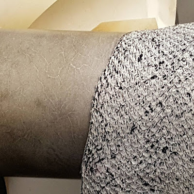
And, because he couldn't help himself, Fritz Otto took a close look at it. The textured shark leather onlays intrigued him...

"Interesting texture on this shark leather, and you did ok binding it ..."


Saturday, February 22, 2020

Old Man and the Sea

We saw Fritz Otto helping turn that delicious mackerel into parchment. Here the binding one of the half-skins was used on, Hemingway's Old Man and the Sea. The other half goes in the skin archive. Below the binding I just completed.

Here the top-edge Fritz Otto made. Acrylics in paste with some stippling for waves...
The book is still in-process, and the colored flyleaf will be tipped to the next leaf
just along the fore-edge as one of the last steps.

The mackerel skin was backed with gray Morike paper and cut out to match the
contours of the skin. The mackerel is a standing for the swordfish in the story.
Scars/distressed areas on the skin represent the life and death struggle of fish and Santiago.
The book was sewn on three thongs of shark leather, a metaphor
for the sharks that ate Santiago's swordfish...

This is a Dorfner-style open-joint binding. The parchment
was not covered or trimmed back, so shows the contours
of the fish. Doublure and flyleaf Cave Paper "layered indigo day."

The boards were covered in Pergamena dyed goat
parchment, title stamped in graphite foil.

Here the completed binding. Shark thong ends capped by weathered
wood representing Santiago's boat. 

Book Arts arts du livre Canada (Vol 10., Nr. 2, 2019)

"Fish Tales, experiments with fish skin for bookbinding
The New Bookbinder: Journal of Designer Bookbinders (2020)

Saturday, February 8, 2020

Springback Fine Binding

I love springback bindings, especially the German version I learned during my apprenticeship. Below images of one I completed on the textblock of the exhibit catalog for L'Infinito, one of those international bookbinding competitions and exhibitions. This one was organized by the Provincia di Macerata. Competitors were asked to design bindings for the poem L'Infinito by Italian poet Giacomo Leopardi (1798-1837). The catalog has a section for the 125 bindings that formed the exhibition and are considered the best of the entries submitted. The remaining 475 submissions are divided by national school and reproduced without commentary. I lifted the description from Oak Knoll Books who have a copy of the catalog available in case someone wants to bind it. ;-) I never bought the set book for the exhibit, but did get the catalog as I have a great weakness for exhibit catalogs for my personal library.

Exhibit catalogs in my library. An intervention might be called for...

This all makes for a very hefty tome, just begging for a springback binding. I wanted to show the underlying structure and love veiney calf parchment. This is what I came up with:

German-style springback; sewn on three tapes with endsheets of Roma paper; graphite top edge; red leather wrapped endband; covered with two veined calf vellum panels at top and bottom with center panel painted with textured acrylic; spine and sewing exposed in center panel and painted with textured acrylics; title stamped in gold. 28 x 25.5 x 6.5 cm. Bound 2004.

Parchment panels that wrapped around at head and tail. 

Detail of spine with the book closed.

Detail of spine with the book opened.

Looking down the "hollow" of the spine.
My recently updated tutorial for the German style of springback can be viewed here and the print article from 2003 downloaded here.

Just make sure the spring isn't too "strong." ðŸ˜‰


Saturday, March 23, 2019

Carsick and Corrugated Cardboard

Good article in the New York Times (3/22/19) about the resurgence of corrugated manufacturing in the US. Nice segue to sharing images of this project from last summer...

Last summer I finally got around to binding my copy of John Waters' Carsick that chronicled his hitchhiking trip from Bawlmer to San Francisco. Carsick is your "traditional" modern trade hardcover, adhesive bound with dust jacket... Nothing special.

So, rip cover off, take tacking iron (with protective layer between) to remove the bulk of the hot-melt adhesive and round while still warm. Next, attach a rolled cord to make a shoulder as there was none, make the endpapers, trim, give top edge a coloring of Woodland Scenics asphalt color (bookbinding and choo-choos overlap), apply rolled endbands, line spine, make case, cover with distressed corrugated cardboard, case-in. Got it? Good. Just another German case binding...


The start of Mr. Waters' journey, and mine.
Thought it might find use in the design.

A trip to AAA (Just like Mr. Waters) to get some road maps.
Started in Bawlmer/Maryland, an overall of the US, and finally San Francisco.

Textblock done, next the covers. Start with your typical corrugated cardboard box like you might pick up to make your hitchhiking sign, write destination (or in this case title) in Sharpie, and done. My vodka box was too clean though, so some light weathering was called for. Enter a post lunch-time coffee on Waverly Avenue, busy during that time, including with heavy truck traffic, just like along the interstate.


Result of the weathering...

Mr. Waters holding his sign.
From a review in the Chicago Tribune.

Needed a bit more, so coffee stains from the bottom of the cup.

End on view showing edge treatment, endband making use of map cutoffs,
and the corrugated.

The endpapers...

Overall view of cover. A torn strip of map depicting the heartland along the bottom

A very different yet very fun project where I felt I was channeling Richard Minsky's "material as metaphor" concept.

I enjoyed reading the book, too,really three stories bound as one, his fantasy trip, his horror trip, and reality. My masseuse (who didn't care for the book) undertook a similar trip last summer, retracing the one he made 40 years ago. Like Waters' experience, his reality was similar, a trip filled with meeting interesting people with interesting stories that reveal not all is lost in 'Merica.

Saturday, November 25, 2017

Bone Folder Design Prototypes

While waiting for the Boss Dog Press to complete the printing of the fine press edition of my translation of Ernst Collin's Der Pressbengel (as The Bone Folder), I decided to experiment with some design ideas on the sheets I offer for download. While the format of these is 8.5" x 11" folded in half, the fine press edition will have a trim size of 9" x 12."

N.b. The Boss Dog's printing is almost complete, and will have been more than worth the wait. Like a fine wine or beer.

Binding 1, Dorfner/de Gonet style:


The design is a play on the question and answer dialog of the text. Sewing supports are vellum back with pared leather to give a more 3-dimension effect. Leather on spine is natural Niger leather and on boards is Harmatan with chagrin for the low relief onlays.

Top edge in graphite with hand sewn endbands. The image also shows the open joint structure of the Dorfner/de Gonet style

Collaged doublures and flyleaves with dilute colored paste washes. Base of the collage is Collin's original text in German, with onlays from articles and books on topics referenced in the book that were written by Collin.
I was inspired to try this by some of the work of Mark Cockram, but mine pale in comparison... Still, I think they work here.


Binding 2, Danish millimeter style:

The Danish millimeter is best described in English by John Hyltoft who presented on it at the Guild of Book Workers 1995 Standards conference (starts on PDF page 33). See his presentation handout here.

Spine covered in salmon parchment with pastepaper boards, invisible salmon parchment corners.
I describe making the salmon parchment here. It was very nice to work with and I still have lots...

Pastepaper doublures and flyleaves that continue the dark to light progression from the cover.
Top edge in graphite with endbands of pastepaper wrapped around a thread core.

Detail of salmon parchment and pastepaper at spine.

If anyone who downloaded the sheets would like to share their binding, send me an email using the "contact" link at top right. I'd love see and perhaps even share...

Sunday, November 13, 2016

Binding Ideas | Einband Ideen

Starting work on some bindings, mostly playing around with designs and texture/color combinations, but also doing real prep so I can hit the ground running...

For the Boss Dog's Three Lectures in the Eberhardtiana series...

Reddish Roma endpaper that matches headings in text with black fish and red eel.
I think I'll go with the black fish, and make more pastepapers...

Below, some ideas for paring fish with goat, a bibliophilic "surf n' turf," for the Boss Dog's edition of my Ernst Collin The Bone Folder. Printing is underway and there are exhibition deadlines coming up in the next 6-months ~ year... Want to have more than one appropriately bound. Why fish? It was something Collin wrote about.


Sunday, May 8, 2016

Pan at the Veatchs Arts of the Book

Very nice to see my binding on the Pennyroyal Press's Pan opposite the title page in the latest catalog (84) from the Veatchs Arts of the Book. You can also see it here. I had a great time binding this, and a big thank you for letting me borrow it back for the 2015 Society of Bookbinders' Competition.

Click to enlarge

Click to enlarge

Click to enlarge


Lots of other fantastic bindings/books in Catalogue 84, so check it out here.

Tuesday, June 24, 2014

Pan


Just completed the long-overdue binding on Eight Wood Engravings On A Theme Of Pan (Northampton: Pennyroyal Press, 1980) with wood engravings by Barry Moser. A delightful well-proportioned smallish book printed in an edition of 130 copies. The text is made up of six epigrams from the Anthologia Graeca, which Moser loosely translates in his afterword. Set in Goudy Greek (12pt. to 36pt.) in 3 or 4 colors, and punctuated with original brush calligraphy by Betse Curtis. Printed on handmade Japanese Etching paper; engravings on sheets of Sekishu.

From the description of this book at The Veatchs, Arts of the Book.


Description: Dorfner/de Gonet "open joint" style binding. Text sewn on two reinforced leather tapes; bottom and fore-edge left uncut with graphite top edge; black leather endband; spine covered in snake-skin; "O'Malley Crackle" flyleaves; boards covered in Pergamena goat vellum with design taken from illustrations underneath; "O'Malley Crackle" doublures and roundels on front of boards. Housed in Layered Indigo Night semi-soft slipcase.


Cave Paper "O'Malley Crackle" flyleaves and doublures.

Semi-soft slipcase of Cave Paper "Layered Indigo Night" with gold stamped snake-skin label.


Overall showing snake-skin spine, "O'Malley Crackle" roundels,
with design taken from illustrations underneath Pergamena goat vellum.

Sunday, June 8, 2014

Millimeter Binding (Edelpappband)

The German-style millimeter binding (Edelpappband) is the "ennobled" version of the paper-covered case binding and should not be confused with the equally elegant but fundamentally different Danish millimeter binding (link to John Hyltoft: Danish Millimeter Binding from GBW Standards 1995). I described the case-bound German version of the millimeter binding in The Bonefolder, Volume 1, No. 2, Spring 2005, and Renate Mesmer the "in boards" version at the GBW Standards in 2005.

Ernst Collin discussed aspects of this binding on "Wednesday" in his Pressbengel, link to the English Bone Folder at left.

See also the 2005 Bonefolder Edelpappband / “Millimeter” Binding Bind-O-Rama where readers explored this structure, many for the first time.

Below are some maquettes I made to illustrate the covering stages for the version with the narrow leather edge along top and bottom (or fore-edges) and the version with invisible corners.


Below a diagram showing some of the design variants possible.


Overall images of the three books above

The Enchiridon of Epictetus, Press Intermezzo, 1997.

Edelpappband / millimeter binding: Endpapers of red Roma paper; top edge gilt; endband of pastepaper around thread core, vellum trim along top and bottom edges; covered in hand-made pastepaper; title in gold on front cover. 16.5 x 12 x 1cm. Bound 2005.


Saturday Night, 1953 / The Elements, Angorfa Press, 1998.

Edelpappband / millimeter binding: Sewn on 3 ramie tapes; plain endsheets same as text; solid graphite edges; red eel-skin leather endbands; "millimeter / edelpappband" case covered in original pastepaper by binder with blue eel-skin leather trim at head, tail, and along foreedges; title stamped in black on spine. 18 x 13 x .7cm. Bound 2003. The book, in the "Cased Binding" category, was awarded the Harmatan Leather Award for Forwarding in the Society of Bookbinders' 2003 Bookbinding Competition.


Fritz and Trudi Eberhardt, Rules for Bookbinders, The Boss Dog Press, 2003.

Edelpappband / millimeter binding: Endpapers same as text; top edge in graphite and burnished; dark red leather endband around thread core; vellum trim at head/tail caps with invisible corners; covered in handmade pastepaper; title in graphite on front cover. Soft “Ascona-style” slipcase covered in paper to match book with title in graphite on spine. 18 x 12.5 x 1cm. Bound 2005.
Other examples can be seen among the bindings here.