Monday, April 18, 2022

Promotional Leaflet by Ernst Collin for Dornemann & Co.

Back in September 2021 I acquired a binding containing two small publications by Paul Kersten and 5 advertising leaflets for type holders and brass type made by Dornemann & Co. in Magdeburg. Two were written by Paul Kersten, two unattributed, and one is by Ernst Collin. Collin was  no stranger to commercial work, also having written articles for Wilhelm Leo that were included in a calendar that they published annually.

P. Kersten. Geometrisches Zeichnen u Handvergoldung.
The title is hand letter on the cloth.

Works included in the binding are:

  • Kersten, Paul. Geometrisches Zeichnen für Buchbinder. Verlag des Allgemeinen Anzeigers für Buchbindereien, Stuttgart, 1928. (Geometric Diagramming for Bookbinders)
    • This text came out in a new edition in 1935 with one section rewritten to reflect the new power structure - how to properly represent the swastika. Perhaps a post for another day.
  • Kersten, Paul. Lehrbuch der Handvergoldung: Eine Anleitung zum Selbsterlernen. Verlag von Wilhelm Knapp, Halle a. Saale, 1930. (Manual for Finishing: Instructions for learning on ones own)

Werbeschriften (Advertising leaflets):

  • Kersten, Paul. Etwas über Schriftkästen. Dornemann & Co., Magdeburg, [s.d.] (About Typeholders)
  • Kersten, Paul. Messing- oder Blei-Schriften. Werbeschrift Nr. 4. Dornemann & Co., Magdeburg, [s.d.] (Brass or Lead Type)
  • [s.n.]. Schriftkästen. Dornemann & Co., Magdeburg, 1928. 
  • [s.n.]. Messingschrift-Giesserei Dornemann & Co., Magdeburg. Werbeschrift Nr. 8, Dornemann & Co., Magdeburg, [s.d.]. (Brass Type Foundery Dornemann & Co., Magdeburg - about the foundery) Written in German, French, English, Spanish. (Boîtes, Typeholders, Cajetínes Composteurs, Lettering Pallets)
  • Collin, Ernst. Messingschriften für den Handvergolder. Werbeschrift Nr. 3, Dornemann & Co., Magdeburg, [s.d.]. (Brass Type for Gold Finishers)

While the German National Library has others of the series of Werbeschriften in its catalog, these do not appear...

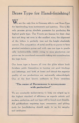
Here the English page of Messingschrift-Giesserei Dornemann & Co. These sentiments are also reflected in Collin's leaflet.


Brass Type for Hand=Finishing!

We are the only firm in Germany able to cast Brass Type for hand=tooling from instruments and matrices. This is the only process giving _bsolute guarantee for producing the highest grade type. Our Founts are famous for their clear face and deep cut even in the smallest sizes, the alignment of the letters is perfectly true and the height absolutely correct. The composition of metal used by us proves to have greatest resistance power and with care our type is practically indestructible, whilst owing to mass production our prices can be considered reasonable taking info consideration the high finish.

Our brass type is known all over the globe where book finishers pride themselves in turning out good bindings and letterings, and both at home and abroad the superior quality of our productions are universally acknowledged. One of fhe best known craftsmen in Paris considers 

"The name of Dornemann is synonymous with perfection!"

We are constantly endeavouring to keep our output up to the highest standard of efficiency as regards artistic and modern perfection, and our type will be found most durable. All goldfinishers requiring type, ornaments, and gilding tools for handlettering should apply fo us for samples and catalogues.


[Edit: To learn how these Dornemann type faces were cast, read "Sandcasting brass types for bookbinders" on Dan Reynold's Type Off  blog.

Below the German text of Collin's pamphlet.


When I returned from my apprenticeship in Germany, I ordered a basic set of pallets and gouges for finishing from via the West German distributor for Dornemann, still in Magdeburg and in the DDR.


Dornemann also produced a set of pallets and gouges designed by Ignatz Wiemeler, one of the finest design binders, ever.

In 1987, pre-reunification the pallets were 229  and the gouges 285 Deutsch Marks. In 1991 I ordered the other set of gouges and the price had increased to 557 Deutsch Marks. For this Wessi, it would have been smarter to buy all in 1987, but who would have known the wall would come down 2 years later. All in all, good that it came down.

Looking east and at the building for the State Publisher of the DDR.
This picture and the next were taken by me in November 1984.
More from that visit and the one in December 1989 here.

Looking over the wall. The image was taken with a telephoto.
Between the Wall (Ebertstrasse) and the Staatsverlag (Wilhelmstrasse)
was once Hitlers bunker... Now the "death strip" has been filled in with buildings,
but just to the left of this picture is the Memorial to the Murdered Jews of Europe.

History is everywhere, and Ernst Collin and his family were certainly a part of it on many levels.

Saturday, March 26, 2022

The Binding of a Book, Film and Manual, 1936.

First post on bookbinding history, manuals, all the things that were usually featured on this blog since the end of 2021.

Training in the trades in Germany was very regulated and standardized with training in the apprentices bindery, comprehensive manuals, trade school and other workshops all coordinated with each other. Exams and the pieces and skills to be demonstrated were the same across the country each year as well. The intent was that binderies and the Meister knew what they could [theoretically] expect from each new journeyman with the latter expected to arrive with their tools and ready to work from day one...

Das Einbinden eines Buches (The Binding of a Book) is a very basic manual that described the construction of a Deckenband (case binding in the German (Bradelesque) tradition). As is common, lots of text with a few illustrations. What makes this text unique in my experience with the German literature is that it was published to accompany a silent film in two parts in which the steps are demonstrated. The book and film were produced by Georg Netzband (instructor for diagraming) and the Reichstelle fur den Unterrichtsfilm (National office for instructional films) in 1936.

The film was released in two parts:

  • Part 1: The endpapers; sewing; sewing supports.
  • Part 2: Rounding; the book cover (case). 
Part 2 begins with a history of bookbinding, but in a sign of the times concludes this history with a mention of the binding of Hitler's Mein Kampf that written on parchment, embellished with ornaments of German plants, total weight of this presentation binding, 70 pounds... It was presented to Hitler at the annual day of the trades (Handwerkertag) in 1936. The binding was depicted and described in the Archiv für Buchbinderei, 1936 (pp 46-48).


Here the complete film with both parts combined by me.


Interesting to me the construction of the hooked endpaper. The diagram is below. Not illustrated in the video (starting at 2:12) is the attaching of the reinforcing cloth ("Shirting", a starched muslin-like fabric), the endpaper being just paper. The cloth would strengthen the joint and connection though... The "fliegender Falz" a "guard" is used to attach the case to the textblock before putting down the pastedowns.

The endpaper construction.

After folding, and the sawing in for the recessed cords, these endpapers get hooked around the first and last sections for sewing.

Hooking the endpapers around the 1st and last sections.

After sewing and forwarding (the cords get untwisted and fanned out onto the guard - see also this post), the case gets constructed, and spine covered. In this case (pun intended) it will be a quarter binding with corners. The case then gets attached to the textblock (at 19:37) by way of the "fliegender Falz". This ensures that everything fits before attaching corners covering sides, and putting down the pastedowns.

Gluing out the guard to adhere the case. Note the frayed out cords.

In many respects, the steps and techniques demonstrated and described go back to the 18th/19th century roots of this structure as it would have been applied by the trade. The completed book can be as utilitarian or fancied up as desired.

I presented a hands-on workshop for the University of Iowa Libraries and Center for the Book at the end of September on this topic and will be transforming my workshop handout with comprehensive review of the literature into an article for the Guild of Book Workers Journal over the course of this year. Everything is mostly there, but loose ends to connect...

Saturday, January 29, 2022

Fritz Otto Photographing Buchbinderei

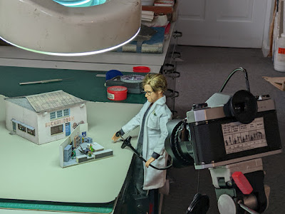
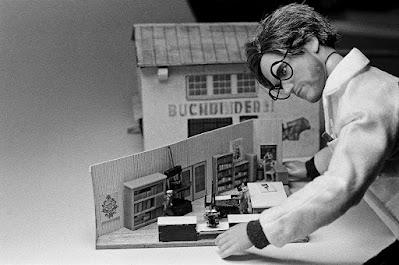
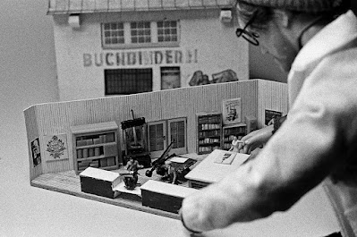
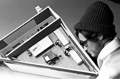
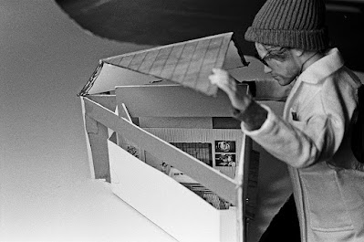
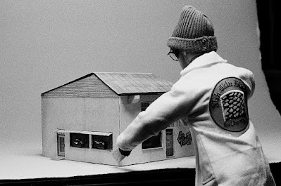
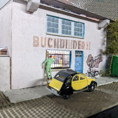
Despite how easy it is to take pictures these days, Fritz Otto prefers black and white film. It's the tones and graininess he likes. Here we took some interior images of Buchbinderei before putting it back on the layout. The black and white images he took using a self-timer, though it was very hard to hold still for those 1-2 seconds.

All images shot on Ilford HP5 400 speed black and white film using a tripod and cable release for these 1-2 second average exposures. And no, I did not forget the Farbfilm. Lighting was provided by the cool white fluorescent in the task light visible in the first image below.

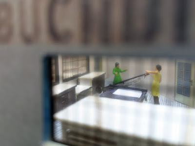
Taking a photo of the little scene.

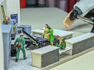
Here an up-close view.

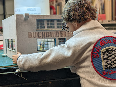
Holding v-e-r-y still.


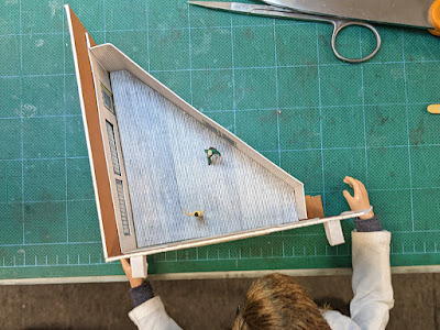
An overhead with the roof off.

Putting the roof back on.

And, back to the layout it went...

Friday, January 14, 2022

Bindery Done

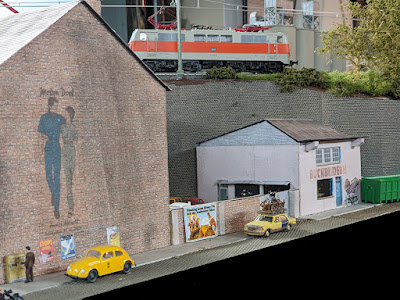
There was once a bindery in Berlin that was situated under railroad tracks... Incorporating that into my train layout seemed like a wonderful way to combine interests...

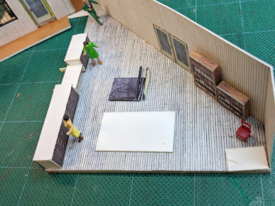
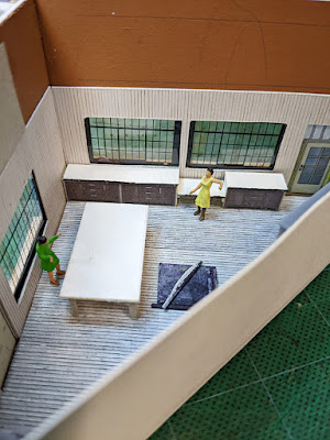
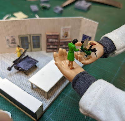
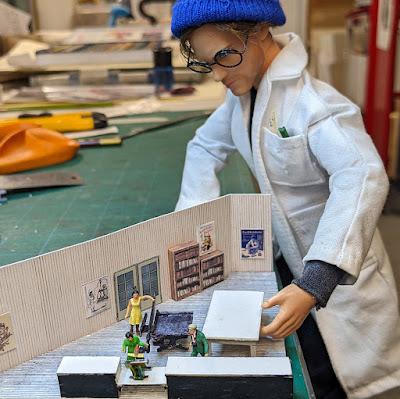
This is the concluding post of my "bindery" thread, wrapping up my big push in the last week or so to outfit the interior of the bindery. Shelves and cabinet fronts downloaded from Scalescenes, a few shelves ordered (3-d printed and laser cut) that still require work, but the heavy lifting of workbench, counter tops, board shear, Prägnant stamping press, and standing press were all scratch built to 1:87 or thereabouts. As a frame of reference most figures are just under 2cm tall, and "standard" bench height is about 1cm high.

Not sure why I do this to myself as it would have been so much easier to just glue in some photos from a bindery, set back behind the [grimy] window to make it look realish. What I do know is that it wouldn't have been half as much fun. Bonus, Fritz Otto and his smaller hands helped out a lot.

Counters and shelves assembled. That dropped section is
that way for a reason. 😉

Bench assembled. It has storage shelves
underneath for board and paper.
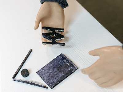
The black things are parts for the board shear.

No, that's not a Star Wars TIE fighter... Just board shear parts.

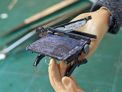
The assembled board shear, really just a massively over-sized
paper/sheet metal cutter. Note the blade...

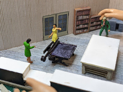
Bindery staff debating the position of the blade when not in use...
Down like above, ...

..., or up like here. Most colleagues seem to say down.
I have mine up, so it's ready to use...
Yes, the blade moves.

Next piece of equipment, the Prägnant stamping press.
I loved using this as an apprentice because it was very easy to
adjust and you could see exactly where the type was going...
More here on Instagram.

See where the Prägnant stamping press goes.
Lower than the counters is the ideal working height.

Last big piece of equipment, a standing press. Still want to make
some hand-/finishing-presses, but yikes...
Note the posters on walls.
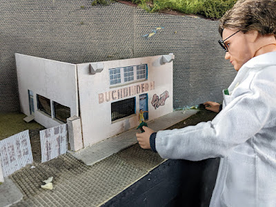
The posters for the bindery walls pull together a lot of threads from my bookbinding
related life, from Ernst Collin and W. Collin, to Babette, to Werner Kiessig,
to apprentice journal cartoons and bindery advertising.
Several also reference women binders, and this is a woman run bindery.

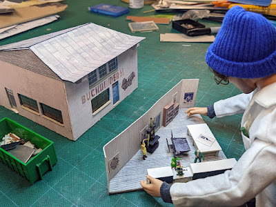
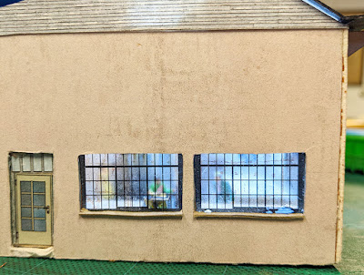
The bindery has a copper clad roof, too. And, yes, it is removable
to get the best view of the details, and light it up, sort of. 
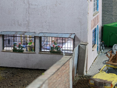
Still some details to add like awnings over the side door and windows.
Also going to replace the windows. I liked the griminess,
but when sealing it with mat spray it got too cloudy.
It's good to have clean windows, and this is Germany after all.

Looking in through the new windows.

And more windows you can see through. Also added some window boxes an awning above.

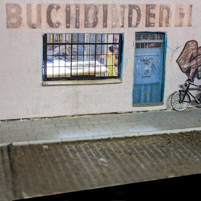
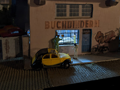
We're closed now, but it looks like someone left their bike outside.
Hopefully, it'll still be there in the morning.

Still to do beyond the things already mentioned, making some Potemkinish stacks of work in progress, and hanging a shingle from the facade. Loving how this looks, and glad to have this model on my train layout, especially as it ties together so many personal experiences and research interests.

Getting the windows washed for the public opening of Buchbinderei.
The bike seems to have made it through the night unscathed.

Buchbinderei at night. Everyone is working late...

Buchbinderei is also no more, the space having become Tipico, a betting salon. As can be expected, the facade was repainted as well. I will imagine that the original Buchbinderi is just hidden beneath the sign... 

Tipico, formerly Buchbinderei, in Berlin.
Photo by https://buchrestaurierung-berlin.de/.
Danke für die Aufnahme.


Saturday, January 1, 2022

Bindery Interior Progress

It's always wonderful when different parts of our lives and interests can intersect. In addition to bookbinding and conservation, model railroading has long been an interest and big part of my life, also in terms of basement square footage. 😏

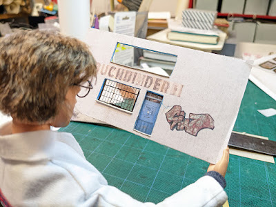
In an earlier post, I described using photographic images to reinterpret an existing structure on my layout. At this stage almost all the structures on my layout are made from cardboard and paper including laser cut kits, but increasingly built from scratch by me using scraps from the bindery. In addition to the raw materials, there are also the skills of a binder that are widely applied, especially box making. After all, what is structure but an overly complicated box. You can read descriptions of some other similar projects on my main model railroad page.

Fritz Otto inspecting the facade so far.

Still a ways to go, but the elements fit on this weird, triangular
building site. Here the new bindery owner Gertrud Jannowitz poses
in front while her picture is taken [for the local paper?].

More images of the bindery exterior construction on the Papphausen blog. Papphausen? Papp[e] = card or cardboard. Makes sense, right?


Still to be determined is the interior, but the space is framed out, walls up, ... Pics of that process here. Now comes the hard work of detailing the interior with shelves, benches, storage, a desk, stools, a board shear, presses... We'll see how I make it work, but in 1:87?!?! I'll figure something out.

Looking in...

Finally, another fun fact is that there are numerous bookbinders and practitioners of allied arts and crafts who are also ferroequinologists. Gary Frost, Bernie Vinzani, and Bob Hanmer come to mind. Know anyone else?

Tuesday, December 21, 2021

Pressbengel Deluxe Edition

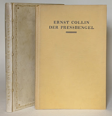
Sometime late this summer while googling around aimlessly, I found a link to what was described as the deluxe edition of Ernst Collin's Pressbengel bound in full parchment. This was on my bucket list and given that it was limited to 30 copies bound in either full leather or parchment, the time it was published in, and the history of that time, including WW II, I felt it was nothing but a dream. The Heftlade the journal of the Jakob-Krause-Bundes published by Ernst Collin had an advertisement for the Pressbengel. A copy of the deluxe in leather is depicted in the Max Hettler collection collection in Stuttgart, the binding for both variants bound for the Euphorion Verlag by Hübel & Denck in Leipzig. 

Regular with spine of deluxe bound in parchment at left.
The title stamping is identical between the leather and
parchment variants of the deluxe edition.

Der Pressbengel, 1000 copies bound in paper,
30 copies on handmade Zanders rag paper, bound 
in full leather or parchment.

Below the pricing for the Pressbengel, leather or parchment for 85 Marks, paper for 4.50 Marks. This was during the period of hyper-inflation that started the end of 1922 and extended through 1923, so I will need to do some real math as hyperinflation currency was printed at ever greater denominations. A website that converts historical currency values calculated that 85 Mark (1922) has a value of $3931.93 current dollars, and 4.50 Mark (1922) $208.16 current dollars. Can that be right? More on hyper-inflation in my annual post from 2020.

85 [Gold] Marks for the deluxe, 4.50 for the paper binding

Anyhow, back to the listing I found googling... I had not given myself a top-end budget for the deluxe, so ordered on the spot and had it arrive ca. 3 weeks later. Below pictures with some detail views that also raised questions...

Spine and front of deluxe. The book was
sewn on 5 parchment slips.

Colophon indicating this copy number 7.

Top edge gilt with hand-sewn endband. All leaves are perfectly
flush and gilt.

An Euphorion [Verlag] binding.
Note the sloppy trimming with the blue (fill?) underneath.

Bound at Hübel & Denck in Leipzig.

Cloth guard around made endpaper signature.
Paper on verso of 1st and 2nd flyleaves identical to text.
The cloth was common on full vellum bindings. and would have
extended across the full width of the doublure. This is also how
I learned it during my apprenticeship in Germany.

The 5 vellum slips as seen through the doublure.
Note the staining on the flyleaf, also visible in the back.
Was the staining and abrasion/tearing in the joint the result of
a repair, or do we blame an apprentice?

Handmade rag paper for the text block measures 10 thousandths
of an inch or .25 mm. Rather thick and stiff...

Ernst Collin wrote an article about the publisher's bindings created for the Euphorion Verlag at Hübel & Denck in the Archiv für Buchgewerbe und Graphik, vol 58, 1921 (pp. 270-271). Pictures accompanying the article can be viewed here.

In the article, Collin wrote "that the bindings he viewed for the article were less than beautiful (wenig schön) but serviceable exemplars of what we would consider fine bindings... The bindings are stamped with Euphorion Verlag and Hübel & Denck Leipzig." Keeping in mind the exponential increase in luxury editions, Collin wrote that the owner of such an edition is [still] entitled to work that  represents the best in terms of craft and aesthetics, balanced against the cost pressures exerted on the publisher, and always bound by hand. Production of these bindings was managed by Heinrich Bahle who was a member of the Jakob-Krause-Bundes (precursor to the Meister der Einbandkunst). Collin notes that by indicating the relationship between publisher and binder that it was a joint effort. This also includes the effort that went into the work of the publisher, such as negotiating with the printer about type face and typography, something that is not always as perfect as it should be at the beginning of a relationship. Continuing, Collin notes that these bindings are created using classical tooling patterns and that the judgement of the expert bookbinder is critical, given that the publisher is not an expert in these areas. He closes with the remark that the illustrated bindings are representative of this collaboration, even if they can only give a weak impression of the beauty of the work. Taken together, Collin seems to be indicating that while a good start, the relationship and results of Euphorion and Hübel & Denck has room for improvement. Collin writing this article and then publishing his Pressbengel with the same publisher, a regular occurrence for him and others illustrates how tight-knit the bibliophilic fields were.

This was written a year before the Pressbengel was written and published. Examining my binding of the deluxe in parchment closely leaves me in agreement with some of Collin's sentiments in the article. I cannot tell whether the "sloppiness" where the doublure was trimmed and the staining and abrasion in the joint of same are the result of a repair or regular production, but the choice of very heavy paper, more like cover stock really, and other details lead me to believe the latter. Other factors include that the deluxe was likely bound on sale to the collectors preference and the overall impact of hyperinflation on labor, materials, moral, ... meaning that it may have been "good enough".